
[CSS 속성] 레이아웃 (float, clear)
목차
1. float
2. clear
float

float은 요소를 보통의 흐름에서 벗어나게 할 지를 결정하는 속성이다.
보통 요소들은 위에서 아래로, 왼쪽에서 오른쪽으로 배치된다.
float을 사용하면 이 흐름을 벗어나게 하여 요소가 독자적인 공간에 배치될 수 있게 한다.
기본값은 none이며 요소가 float되지 않은 상태이다.
left는 컨테이너의 왼쪽에 float한다.
right는 컨테이너의 오른쪽에 float한다.
float에는 크게 3가지 특징이 있다.
1. float된 요소를 보통의 흐름에서 벗어나 띄워지게 함
2. 주변 텍스트나 인라인 요소가 float된 요소의 주위를 감싸게됨
3. float된 대부분 요소의 display를 block으로 변경함(inline-table, flex 등 제외).
예제를 통해 직접 확인해보자.
<!--float의 특징1-->
<!DOCTYPE html>
<html lang="ko">
    <head>
        <meta charset="UTF-8">
        <title>float</title>
        <link href="css/float.css" rel="stylesheet">
    </head>
    <body>
        <h2>요소를 보통의 흐름에서 벗어나 띄워지게 함</h2>
        <div class="container">
            <div>box1</div>
            <div>box2</div>
        </div>
    </body>
</html>
/*float.css 파일*/
.container {
width: 400px;
border: 1px dashed black;
padding: 15px;
}
.container div {
width: 100px;
height: 100px;
}
.container div:nth-child(1) {
background-color: green;
}
.container div:nth-child(2) {
background-color: skyblue;
}

이 코드에서 box1에 float: left; 속성을 지정해보자.
<!--float의 특징1-->
<!--box1에 float: left; 적용-->
<!--css파일은 위 예제와 동일-->
<!DOCTYPE html>
<html lang="ko">
    <head>
        <meta charset="UTF-8">
        <title>float</title>
        <link href="css/float.css" rel="stylesheet">
    </head>
    <body>
        <h2>요소를 보통의 흐름에서 벗어나 띄워지게 함</h2>
        <div class="container">
            <div style="float: left">box1</div>
            <div>box2</div>
        </div>
    </body>
</html>

브라우저를 보니 box2의 텍스트만 보이고 하늘색의 배경은 없어졌다.
box1이 이 컨테이너에서 띄워졌기 때문인데 말 그대로 컨테이너 위에 둥둥 떠있다고 생각하면 된다.
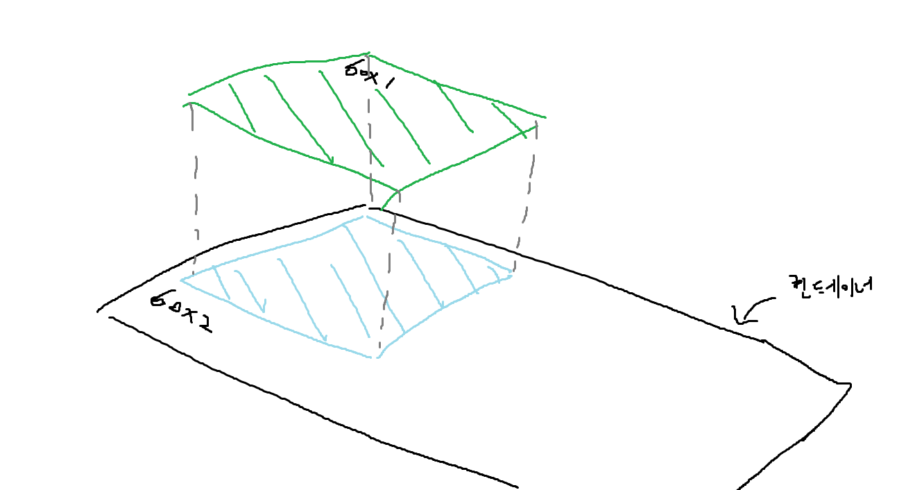
이해하기 쉽게 옆에서 요소들을 봤다고 생각하면 위 그림처럼 될 것이다.
box1이 공중에 떠있고 그 빈 자리를 box2의 스타일이 채우고 있는 모습이다.
float된다고 해서 본인의 영역은 사라지지 않아서 box2의 텍스트의 경우 아래에 위치해 있는 것을 볼 수 있다.
이제 예제에서 box2의 크기를 좀 더 키워보면
<!--float의 특징1-->
<!--box2의 크기를 키움-->
<!--css파일은 위 예제와 동일-->
<!DOCTYPE html>
<html lang="ko">
    <head>
        <meta charset="UTF-8">
        <title>float</title>
        <link href="css/float.css" rel="stylesheet">
    </head>
    <body>
        <h2>요소를 보통의 흐름에서 벗어나 띄워지게 함</h2>
        <div class="container">
            <div style="float: left">box1</div>
            <div style="width: 150px; height: 150px">box2</div>
        </div>
    </body>
</html>

box1은 공중에 떠있고 box2가 그 밑에 위치하는 것을 잘 볼 수 있다.
이번에는 float된 요소를 텍스트나 인라인 요소가 감싸는 모습을 확인해보자.
<!--float의 특징2-->
<!DOCTYPE html>
<html lang="ko">
    <head>
        <meta charset="UTF-8">
        <title>float</title>
        <link href="css/float.css" rel="stylesheet">
    </head>
    <body>
        <h2>주변 텍스트나 인라인요소가 주위를 감싸는 특징이 있음</h2>
        <div class="container">
            <div>box1</div>
            <div>box2</div>
            <p>Lorem ipsum dolor sit, amet consectetur adipisicing elit. Tempora quibusdam cumque quod exercitationem error ipsa sed praesentium dolorem dicta totam, consectetur voluptatibus aliquam excepturi perspiciatis impedit, nesciunt sapiente, nulla at.</p>
        </div>
    </body>
</html>
/*float.css 파일*/
.container {
width: 400px;
border: 1px dashed black;
padding: 15px;
}
.container div {
width: 100px;
height: 100px;
}
.container div:nth-child(1) {
background-color: green;
}
.container div:nth-child(2) {
background-color: skyblue;
}

이 예제에서 box1과 box2를 각각 왼쪽, 오른쪽에 float해보자.
<!--float의 특징2-->
<!--box1과 box2를 각각 왼쪽, 오른쪽에 float-->
<!--css파일은 위 예제와 같음-->
<!DOCTYPE html>
<html lang="ko">
    <head>
        <meta charset="UTF-8">
        <title>float</title>
        <link href="css/float.css" rel="stylesheet">
    </head>
    <body>
        <h2>주변 텍스트나 인라인요소가 주위를 감싸는 특징이 있음</h2>
        <div class="container">
            <div style="float: left">box1</div>
            <div style="float: right">box2</div>
            <p>Lorem ipsum dolor sit, amet consectetur adipisicing elit. Tempora quibusdam cumque quod exercitationem error ipsa sed praesentium dolorem dicta totam, consectetur voluptatibus aliquam excepturi perspiciatis impedit, nesciunt sapiente, nulla at.</p>
        </div>
    </body>
</html>

p 태그의 텍스트가 float된 box1과 box2를 감싸고있는 것을 볼 수 있다.
특징1에서 설명했듯이 float이 되더라도 본인의 영역을 그대로 가지고 있기 때문에 텍스트가 그 영역을 피해 위치하는 것이라 이해하면 쉽다.
그런데 텍스트나 인라인 요소가 float된 요소를 감싼다고 했는데 p 태그는 블록 레벨 요소이다.
위 예제에서 p 태그는 어떻게 자리 잡고 있을까?
p태그에 테두리를 주고 float된 요소들을 반투명하게 하여 확인해보자.
<!--float의 특징2-->
<!--p 요소가 차지하는 공간 확인-->
<!--css파일은 위 예제와 같음-->
<!DOCTYPE html>
<html lang="ko">
    <head>
        <meta charset="UTF-8">
        <title>float</title>
        <link href="css/float.css" rel="stylesheet">
    </head>
    <body>
        <h2>주변 텍스트나 인라인요소가 주위를 감싸는 특징이 있음</h2>
        <div class="container">
            <div style="float: left; opacity: 0.5;">box1</div>
            <div style="float: right; opacity: 0.5;">box2</div>
            <p style="border: 2px solid red">Lorem ipsum dolor sit, amet consectetur adipisicing elit. Tempora quibusdam cumque quod exercitationem error ipsa sed praesentium dolorem dicta totam, consectetur voluptatibus aliquam excepturi perspiciatis impedit, nesciunt sapiente, nulla at.</p>
        </div>
    </body>
</html>

p 요소는 float된 요소들 아래에 위치하고 있는 것을 확인할 수 있다.
p 태그 안에 있는 텍스트는 인라인 레벨이기 때문에 float된 요소들을 감싸게 된다.
마지막으로 대부분 요소의 display를 block으로 바꾸는 특징에 대해 알아보자.
<!--float의 특징3-->
<!DOCTYPE html>
<html lang="ko">
    <head>
        <meta charset="UTF-8">
        <title>float</title>
        <link href="css/float.css" rel="stylesheet">
    </head>
    <body>
        <h2>대부분 요소의 display값을 block으로 변경함</h2>
        <div class="container">
            <div>box1</div>
            <span style="background-color: skyblue;">box2</span>
        </div>
    </body>
</html>
/*float.css 파일*/
.container {
width: 400px;
border: 1px dashed black;
padding: 15px;
}
.container div {
width: 100px;
height: 100px;
}
.container div:nth-child(1) {
background-color: green;
}

box2는 위 예제에서 span 태그로 만들어졌다. 인라인 레벨이라는 뜻인데 여기에 float을 적용해보자.
<!--float의 특징3-->
<!--box2를 float-->
<!--css 파일은 위 예제와 같음-->
<!DOCTYPE html>
<html lang="ko">
    <head>
        <meta charset="UTF-8">
        <title>float</title>
        <link href="css/float.css" rel="stylesheet">
    </head>
    <body>
        <h2>대부분 요소의 display값을 block으로 변경함</h2>
        <div class="container">
            <div>box1</div>
            <span style="float: left; background-color: skyblue; width: 100px; height: 100px">box2</span>
        </div>
    </body>
</html>

브라우저에 보이는 것처럼 width와 height가 적용되는 모습을 볼 수 있다.
inline레벨 요소는 width와 height를 지정해도 영향을 받지 않는다. 하지만 float 속성을 설정해줘서 display 값이 block으로 변경되면서 width와 height가 적용되는 것이다.

개발자 도구에서 display를 확인하면 block으로 나온다.
clear

요소를 float된 요소의 영향에서 벗어나게 하는 속성이다.
기본값은 none이며 이 때는 float된 요소의 영향을 받는다.
left는 왼쪽으로 float된 요소의 영향을 받지 않는다.
right는 오른쪽으로 float된 요소의 영향을 받지 않는다.
both는 양쪽으로 float된 요소의 영향을 받지 않는다.
clear 속성을 사용할 때는 요소가 반드시 block 레벨이어야 한다는 것을 주의해야한다.
예제로 각 속성값이 어떻게 동작하는지 알아보자.
<!--clear: none;-->
<!DOCTYPE html>
<html lang="ko">
    <head>
        <meta charset="UTF-8">
        <title>clear</title>
        <link href="css/clear.css" rel="stylesheet">
    </head>
    <body>
        <h2>claer: none</h2>
        <div class="container">
            <div style="float: left">float: left;</div>
            <span style="display: block; clear: none">Lorem ipsum dolor sit, amet consectetur adipisicing elit. Vel, nihil! Sequi perferendis itaque blanditiis et. Cupiditate eveniet dolor eaque nihil repellendus adipisci et, id quam, unde numquam at. Laudantium, vero.</span>
        </div>
    </body>
</html>
/*clear.css 파일*/
.container {
border: 1px dashed black;
}
div, span {
padding: 20px;
border: 1px solid red;
}

clear: none;은 아무런 동작을 하지 않는다.
<!--claer: left;-->
<!--css 파일은 위 예제와 동일-->
<!DOCTYPE html>
<html lang="ko">
    <head>
        <meta charset="UTF-8">
        <title>clear</title>
        <link href="css/clear.css" rel="stylesheet">
    </head>
    <body>
        <h2>claer: left</h2>
        <div class="container">
            <div style="float: left">float: left;</div>
            <span style="display: block; clear: left">Lorem ipsum dolor sit, amet consectetur adipisicing elit. Vel, nihil! Sequi perferendis itaque blanditiis et. Cupiditate eveniet dolor eaque nihil repellendus adipisci et, id quam, unde numquam at. Laudantium, vero.</span>
        </div>
    </body>
</html>

왼쪽으로 float된 요소의 영향을 받지 않는 것을 확인할 수 있다.
<!--clear: right;-->
<!--css 파일은 위 예제와 같음-->
<!DOCTYPE html>
<html lang="ko">
    <head>
        <meta charset="UTF-8">
        <title>clear</title>
        <link href="css/clear.css" rel="stylesheet">
    </head>
    <body>
        <h2>claer: right</h2>
        <div class="container">
            <div style="float: right">float: left;</div>
            <span style="display: block; clear: right">Lorem ipsum dolor sit, amet consectetur adipisicing elit. Vel, nihil! Sequi perferendis itaque blanditiis et. Cupiditate eveniet dolor eaque nihil repellendus adipisci et, id quam, unde numquam at. Laudantium, vero.</span>
        </div>
    </body>
</html>

오른쪽으로 float된 요소의 영향을 받지 않는 것을 볼 수 있다.
<!--clear: both;-->
<!DOCTYPE html>
<html lang="ko">
    <head>
        <meta charset="UTF-8">
        <title>clear</title>
        <link href="css/clear.css" rel="stylesheet">
    </head>
    <body>
        <h2>claer: both</h2>
        <div class="container">
            <div style="float: left">float: left;</div>
            <div style="float: right">float: right;</div>
            <span style="display: block; clear: both">Lorem ipsum dolor sit, amet consectetur adipisicing elit. Vel, nihil! Sequi perferendis itaque blanditiis et. Cupiditate eveniet dolor eaque nihil repellendus adipisci et, id quam, unde numquam at. Laudantium, vero.</span>
        </div>
    </body>
</html>

각각 왼쪽, 오른쪽에 float된 요소의 영향을 받지 않는 것을 볼 수 있다.
가령 float을 사용했을 때 브라우저가 이렇게 보일 수 있는데
<!DOCTYPE html>
<html lang="ko">
    <head>
        <meta charset="UTF-8">
        <title>float</title>
        <link href="css/float.css" rel="stylesheet">
    </head>
    <body>
        <h2>요소를 보통의 흐름에서 벗어나 띄워지게 함</h2>
        <div class="container">
            <div style="float: left">box1</div>
            <div style="float: left">box2</div>
        </div>
        <h2>주변 텍스트나 인라인요소가 주위를 감싸는 특징이 있음</h2>
        <div class="container">
            <div style="float: left">box1</div>
            <div style="float: right">box2</div>
            <p>Lorem ipsum dolor sit, amet consectetur adipisicing elit. Tempora quibusdam cumque quod exercitationem error ipsa sed praesentium dolorem dicta totam, consectetur voluptatibus aliquam excepturi perspiciatis impedit, nesciunt sapiente, nulla at.</p>
        </div>
        <h2>대부분 요소의 display값을 block으로 변경함</h2>
        <div class="container">
            <div>box1</div>
            <span style="float: left; background-color: skyblue; width: 100px; height: 100px">box2</span>
        </div>
    </body>
</html>
/*float.css 파일*/
.container {
width: 400px;
border: 1px dashed black;
padding: 15px;
}
.container div {
width: 100px;
height: 100px;
}
.container div:nth-child(1) {
background-color: green;
}
.container div:nth-child(2) {
background-color: skyblue;
}

이럴 때는 두 번째 컨테이너에 clear를 적용하는 것이 아니라 문제가 발생한 원인이 있는 첫 번째 컨테이너에 clear를 적용한다.
앞의 모든 요소에 float이 올 수 있고 어떤 속성값이 올 지 몰라 뒤의 컨테이너에 clear를 적용하기에는 불필요한 속성들이 너무 많이 사용되기 때문이다.
<!DOCTYPE html>
<html lang="ko">
    <head>
        <meta charset="UTF-8">
        <title>float</title>
        <link href="css/float.css" rel="stylesheet">
    </head>
    <body>
        <h2>요소를 보통의 흐름에서 벗어나 띄워지게 함</h2>
        <div class="container">
            <div style="float: left">box1</div>
            <div style="float: left">box2</div>
            <span style="display: block; clear:both"></span>
        </div>
        <h2>주변 텍스트나 인라인요소가 주위를 감싸는 특징이 있음</h2>
        <div class="container">
            <div style="float: left">box1</div>
            <div style="float: right">box2</div>
            <p>Lorem ipsum dolor sit, amet consectetur adipisicing elit. Tempora quibusdam cumque quod exercitationem error ipsa sed praesentium dolorem dicta totam, consectetur voluptatibus aliquam excepturi perspiciatis impedit, nesciunt sapiente, nulla at.</p>
        </div>
        <h2>대부분 요소의 display값을 block으로 변경함</h2>
        <div class="container">
            <div>box1</div>
            <span style="float: left; background-color: skyblue; width: 100px; height: 100px">box2</span>
        </div>
    </body>
</html>

이렇게 첫 번째 컨테이너에 span 태그를 추가해 claer를 해줌으로써 간단하게 해결한다.
부스트코스의 강의 내용을 정리한 포스트입니다.
https://www.boostcourse.org/cs120/
비전공자를 위한 HTML/CSS
부스트코스 무료 강의
www.boostcourse.org
'공부 > HTML과 CSS' 카테고리의 다른 글
| [미디어쿼리] 미디어쿼리 소개 (0) | 2023.01.03 |
|---|---|
| [CSS 속성] 레이아웃 (position, z-index) (0) | 2022.12.30 |
| [CSS 속성] 레이아웃 (display, visibility) (0) | 2022.12.28 |
| [CSS 속성] 텍스트 (0) | 2022.12.27 |
| [CSS 속성] 폰트 (1) | 2022.12.23 |